How to create an Artist’s Portfolio

Today I had a display at Gilbert White’s House and Gardens in Hampshire. My portfolio was a great feature, people spent ages flicking through and seeing the extent of my skills. It also sparked several interesting conversations and leads.

In short, a portfolio is the perfect way to show off your skills in an effective and physical way, without relying on computers or the internet to access your gallery.

They can be created simply without too much expense or materials, and yet still look professional!

You will need

  • Large (9×7) photographs of your completed works
  • Small (6×4) photographs of your muse images
  • Printed out titles
  • Printed out testimonials from happy customers
  • A large, plain black self-adhesive photo album
  • Guillotine / ruler & scissors

Step 1: Get your photographs printed. I got mine done at Boots pharmacy, and the good thing is that you can edit the photos on the screen to make them fit to the size of the photograph so that no vital parts are cropped out.

IMAG1102

Step 2: Cut off any white edges using a guillotine for sharp lines. I borrowed one at work in my lunch hour.

Step 3: Set out your photos on the page, without peeling back the self-adhesive layer yet. Give the photographs a slight overlap if necessary.

IMAG1107

Step 4: Work out what remaining space you have on your page to fill with the project title and testimonials. Then chose an appropriate font, text size and layout to fit the surrounding space. Keep the font and size regular for all titles, and all other text, but vary the layout as the space allows.

IMAG1109

Step 5: Cut up the testimonials and titles, again using a guillotine if you can.

Step 6: Choose which order you would like to present the portfolio in. I chose chronological (it seemed logical.)

Step 7: Peel pack the plastic layer to expose the adhesive, leaving it still stuck at the far edge so it can be reapplied easily. Carefully press down your photographs and text in your practiced layout, and then swipe the plastic layer back into place using your forearm to get even pressure.

IMAG1112

Step 8: Wash, rinse, repeat (just without the washing and rinsing.)

A word of caution – although the pages are thick, take extra care that you do not accidently skip a page, because every time you peel back the plastic layer to rearrange pages, the adhesive loses a bit of its stick, and it is a little soul wrenching to have to do it AGAIN.

Ta da, a beautiful coffee table portfolio to show people.
Just take care that no-one walks away with it!

IMAG1115

So you want them to actually READ your CV?

I, Imi Woods, Animal Artist, have given myself a metaphorical kick up the backside and decided to start contacting galleries, shops and (gulp) agents.

I looked up “How to write an Artist’s CV” on Google.
It depressed the hell out of me.

“Avoid any formatting at all if possible. No columns, tabs, multiple spaces, words all in caps, quotation marks, or bold formatting. The only formatting needed is italics for exhibition names, article titles and prize names. Stick to one typeface for the entire document. Preferably something simple like Arial or Times Roman. Leave creativity for the art. The CV needs clarity.”

As a self-trained, as yet barely exhibited young Artist… I don’t yet have the facts to speak for me. I have passion, raw talent, beautiful paintings and lots of happy customers… but not the lists of Relevant Education, Exhibitions at the Tate or MoMA, Associations, Publications and Awards that they are really looking for. Sorry, I forgot, I do have the Year 9 Art Prize and I write a blog. I’ll be sure to put that on my CV…

I know that I am going places… I just need a leg up to get on the ladder.

So here are my tips for creating a memorable and interesting CV. The sort of CV that will help the Emerging Artist who doesn’t yet have all the facts to talk for them. It might just get you to the top of the pile… or at least keep you away from the bottom.
Feel free to use ideas from my CV below if you would like.
Please note, this is applicable to other industries too!

print screen of CV

1. Design an interesting layout. Note: a few columns and bullets does not mean interesting. Challenge yourself! Using a table format in Microsoft Word is easy and keeps all of your information in the right place. Keep it clean and functional… but with a bit of pizazz. I put a column going down the left hand side with my name and job title, separated by a block line.

2. Use a bit of colour. I know, not everyone is like me and excited by colours. But one colour as a strong theme running through the CV will draw the eye directly to your CV for the right reasons.

3. Be creative with photographs. This is what is the biggest selling point of my CV. I cut the background out of a photograph of me next to my Artist’s Statement and put it into greyscale. I virtually framed a couple of my paintings too. They are my biggest selling point at the moment, so I see no reason for them not to be put onto my CV. I also cut out the background of a photograph of me painting. I kept the painting in full colour, and greyscaled myself. I guess it says “my art speaks for me”.

4. Do your research about where you are applying to. Angle your CV to bring out qualities that are important to that institution. But don’t fabricate information, tell the facts as they are.

5. Keep your CV focussed. Don’t be a Jack of all trades but a Master of none. I cut out the paragraph detailing my current work on this CV. I feel I have learned a lot in my role as a Submissions Assistant, but can see how galleries would fail to see the relevance.

6. Oh my gosh, proof read your CV! Or get someone else to. Learn how to use that apostrophe correctly. Learn the difference between you’re and your. It’s not that difficult!

7. Show your enthusiasm. I know. Risky.
But right now, my enthusiasm is what is getting me places. People like enthusiastic, friendly people and want to work with them and give them opportunities. On applying for a display space recently in Reading, I was incredibly enthusiastic. Embarassingly so. I was excitable and probably showed my naivety, but received the following as a reply:

“You sound a really enthusiastic and friendly person, just what we need!! Look forward to meeting you soon, oh, and don’t change a thing, you’re fine as you are!”

Wouldn’t you rather buy artwork from someone who loves what they do than someone who is just doing it to pay the bills? I know I would.

*Disclaimer: I don’t know if this will work. Please don’t blame me if you follow my tips and your CV does get put to the bottom of the pile. Maybe galleries and agents are not kindred spirits. Maybe they really do want lists and no formatting. It’s surely worth a shot though, right?

How to paint a King Charles Cavalier Spaniel

You may have spotted him at the Fayre, or you may just be coming across him now. This is Bertie the King Charles Cavalier Spaniel puppy. Judging by his expression, he knows he is royalty. He has a grumpy ‘superior than thou’ expression and gangly legs. Admit it, he is absolutely adorable!

You will need:

  • A lot of time and patience
  • 30cm x 40cm canvas
  • Photograph to copy
  • Large flat paintbrush
  • Range of smaller round paintbrushes
  • Large playmat
  • Water
  • Pencil
  • Ruler
  • Masking tape
  • Acrylic Paint:
    • White
    • Burnt Sienna
    • Burnt Umber
    • Raw Umber
    • Rich Gold
    • Mars Black
    • Cadmium Red

1. Choose your composition: I didn’t have to crop my photograph as it was already a closely cropped image. The customer asked me to keep the background exactly as it was. 
bertie

2. Mark up your canvas. For a 30 x 40 canvas it is easiest to do 5cm2 squares. If you grid out your photo on a screen, make sure that your scaled dimensions are the same. You will probably have to crop parts of your photo and expand it to fill the space.

3. Draw the outline shape of your subject onto the canvas, following the corresponding squares on your screen. For a more detailed way of doing this, see here.

IMAG1033_1_1_

4. Paint the background: The customer wanted the background painted exactly as in the photograph. This was a pink rug and a window. To paint the rug I used various shades of pink and red, and a small round paintbrush to rub the paint in spirals into the canvas. To paint the window, I used a lot of masking tape, a steady hand, and about 50 shades of grey ;-).

5. Begin painting in the beautiful curly ears. This is using a range of rich siennas, raw and burnt umber, gold, flesh tint, etc. Use little round brushes and short curly strokes with a slightly watery paint.

Extend the shades onto the face around the eyes, leaving the nose and a stripe up the forehead in white. Concentrate on the direction of the hairs in the photograph – the top of the ears stick upwards and are paler.

IMAG1057

6. Rim the eyes with a near-black (black mixed with brown or blue or yellow.) Start to paint them in in shades of deep grey to bring out the spherical shape. Put glints in the eyes to bring them to life.

IMAG1064

7.Paint the body in grey. Once you have the grey base you can use paler greys and flesh tint to pick out lighter sections and shadows using a small round brush.

IMAG1068

8. Paint in the nose – make the nostrils a deep black, with a black line up the middle. The rest is a deep grey in a rounded heart shape. Pick out white glints to make it look damp.

Bring out the characteristic downturned mouth. King charles spaniels look grumpy. Really cute, but grumpy. Play on that!
IMAG1073

9. Paint in the collar. If you use metalic paint and a bit of nifty shading, metal rings and disks look very real!

 IMAG1083

10. Decide that following the photograph is a bad idea after all and that limbs appear to be going everywhere! Re-paint the legs by researching other photos where dogs are sitting more nicely! *please note, forward planning and a better photo can eliminate this stage!!

Bertie ARTbyIMI

11. Sniff test of approval?

Bertie and painting

My art journey so far

Here is my art journey so far and exactly what art means in my life.

This used to be a page on my site, but I feel as if this part of my journey is over, and I am starting on a new phase of my life, where this is no longer so relevant… so I am taking it down but sharing it with you today. 

I did a GCSE and an A level in art, but I never really stood out until I found my talent for painting animals.

My Godmother asked me if I would have a go painting her late dog, Hattie, back in July 2009.
I agreed I would have a go, but warned her not to expect much!

I was wrong. I am still particularly proud of the nose and mouth, and I must admit, I admire it every time I go round.

hattie ARTbyIMI

I gave it to her as a thank you for tutoring me through my French A level.
It was the first time I have ever seen her speechless.

I started my first year of university and forgot about art for a year. I was too wrapped up in first-year-fun. But when my Grandpa commissioned me to paint him a tiger in Winter 2010, I jumped at the chance.
First-year-fun was matched with first-year-funds (or lack of) after all.

Raja ARTbyIMI

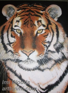
He hung it proudly in his conservatory and
it gave him great pleasure to look at.

With a free time on my hands the next February, I turned the living room of my house at university into my own personal art workshop, to the slight amusement / annoyance of my friends.

Ernie ARTbyIMI

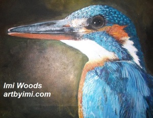
Ernie the kingfisher was created really within the space of a couple of days, and I gave him as a gift to my dad who has always loved birds, especially kingfishers.
In fact, he is such a bird-swot, he discovered by the markings on the beak that Ernie was, in fact, female.

I finished my second year at university with a high 2:1,
and immediately started another painting in June 2011, having well and truly regained my thirst to create.

kingfisher ARTbyIMI  

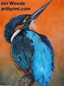
This is my personal favourite, and it hangs on my wall. I don’t think I will ever sell it.

That summer I worked at a summer camp as a Creative Art Activity Instructor. It was the most carefree six weeks of my life so far, playing, laughing and teaching children how to make tortoises out of plasticine (among other equally useful skills).

In September 2011, I created a new project, which was a greater spotted woodpecker after seeing one in the garden.

woodpecker ARTbyIMI

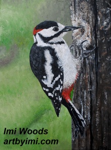
This painting gets the most compliments as being “like a photograph”.
I have used it to form my logo for my business.

After starting back for my third year at university, things went downhill really really quickly. Stress and worry made me very ill, which made me stressed, worried and more ill.. I didn’t do much for the term other than worry a lot and (thankfully) work a lot in the library.
My confidence took a huge knock, and I became… someone meek and self absorbed who wasn’t really me.

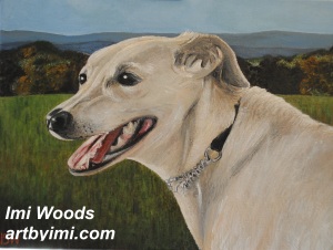
I was asked to do a painting of my boyfriend’s grandmother’s dog, which I started tucked away in my room away from everyone. It stopped me from worrying too much, as my mind is a lot clearer when I paint.
Morris ARTbyIMI
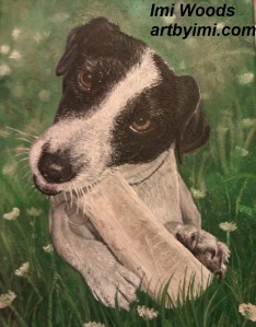
It was then transported half-finished down south for the Christmas holidays. I finished it on Christmas day 2011, sprawled in front of the TV with my mum and dad, before heading round to my boyfriend’s house to present it.

I very quickly got asked to paint his grandmother’s partner’s dog too, which I pencilled out and painted within about 48 hours in February 2012 when things were all getting a bit too much.
I remember it being a rare worry-free day, and I felt like myself again as I painted it.

Basil ARTbyIMI

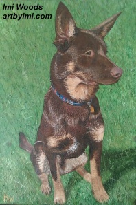
This painting again got a lot of compliments.

The owner was very pleased with it and showed it off to his fellow dog-walkers.

During Easter 2012, I volunteered at an Art-based therapy workshop. It was open to help support people who experienced mental distress, such as depression, substance addiction and chronic illness. It was very therapeutic for me to be around people who were being healed through art, and it helped me to snap out of my self pity.

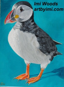
I was able to submit a painting into their annual exhibition for all workers, volunteers and members. I created a painting of a puffin, who I named “Little Brother” after the Latin name. Apparently their white and black feathers look like monks robes.

Little brother ARTbyIMI

I was slowly beginning to heal. My confidence started to return as I realised I was still interesting, talented and worth knowing. Art played a huge part in that due to its ability to quieten my mind, fill me with pride, and bring happiness to others.

I then went back to university to sit my final exams.
They were tough, but I coped well, and was much more myself again.

I graduated with a first class degree and immediately got offered a job.
Things were beginning to fall back into place again.

I decided to paint my boyfriend a large painting for his 23rd birthday in August 2012.
It was a personal challenge because I am used to painting animals.
I got it framed and I am very pleased with how it turned out.
Planes ARTbyIMI

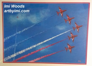
It is in pride of place on his wall.
He told me that if he saw it in a shop he would have wanted it :)

After a few weeks at my new job, I showed a few people my paintings on my phone.
I got a lot of compliments around the office about my talent.

My mentor at work had her first wedding anniversary approaching in September 2012.
She commissioned me to paint a lemur to give to her husband for a present.
The couple got married in Marwell Zoo and are animal mad.

It took me between 30-40 hours work. The pressure was on truly on!
I really wanted to create something beautiful for my first non-family commission.

Lemur ARTbyIMI

It was put on the wall at work for a day while my ego inflated.
She loved it, as did her husband, and I got personal thanks from them both.

I was learning fast at work, and was given more and more responsibility, but I still found the time to paint another puffin.
It took me many weeks to find stolen hours to finish before I was finally happy with the result.

puffin ARTbyIMI

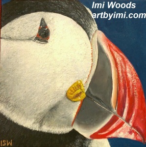
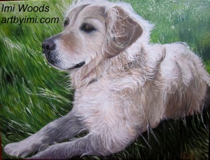
I sold this painting to my Godmother; it is currently in her lounge near her golden retriever (the beginnings of a collection!)

Towards the end of 2012, my painting life hotted up! I worked after work and stolen hours at weekends to complete this painting for my nutritionist.

Frosts ARTbyIMI

She was thrilled when I presented it to her.
It is already up on the wall in her office space for everyone to see.

I got approached by a man at my work who had heard about my art.
He asked me if I would paint him a cat for his wife’s Christmas present.
The painting was quite a challenge, especially getting the face right, as I had not painted cats before.
Spike ARTbyIMI

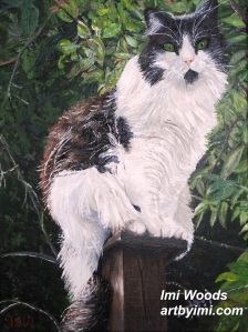
The painting went down a storm with his wife, who “thinks the cat is really there” every time she sees the painting.

I managed to sneak in another Christmas commission for my mentor at work, a repeat customer, previous owner of my lovely lemur. It was a present for her in-laws, of their little terrier, Rosie.

Rosie ARTbyIMI

She absolutely loved it, and I heard that her in-laws loved it too and thought it was the “spitting image” of their cute little dog.

I found out about the British Wildlife Competition online and was very keen to enter, under the category of “World Birds”.
I created this painting of a golden pheasant on a large canvas.
Golden pheasants are bizarre, how on earth an orange feathered, purple-tipped, yellow Mohawk-ed bird adapted I do not know, but it was a pleasure and a big challenge to paint.

goldenpheasantjan13wm

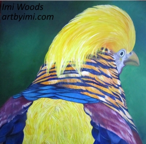
I didn’t get shortlisted. Oh well. Mum does love having the painting on her wall!

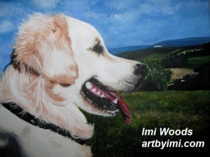
My Godmother commissioned me to paint her current Golden Retriever, Annie, to hang next to Hattie. Life got in the way during this painting, so it took me a couple of weeks for me to complete it. The eye took me about five hours of painting and repainting for me to finally be happy. Painting was not as relaxing as normal during those hours!!

Annie ARTbyIMI

The two dogs will look very fine together on her wall. 

Since painting the golden retriever, I have thrown more and more time into forwarding my business and really getting my name out there. I have got a stall booked for a local fayre so have been busy ordering giclée prints and greeting cards and setting up a Newsletter! I am seeing it as a big investment in my future!

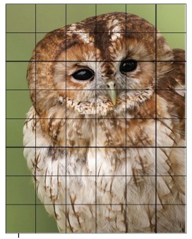
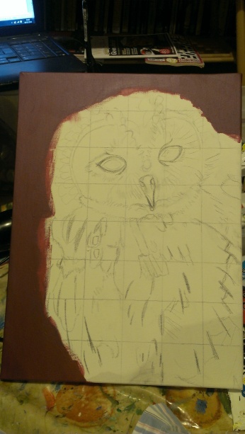
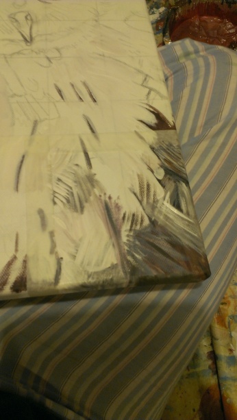
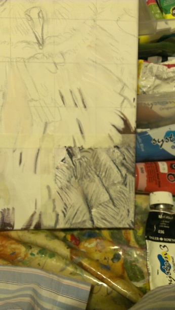
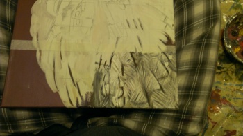
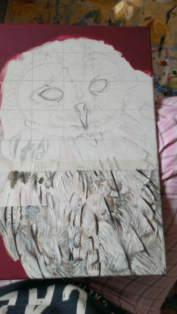
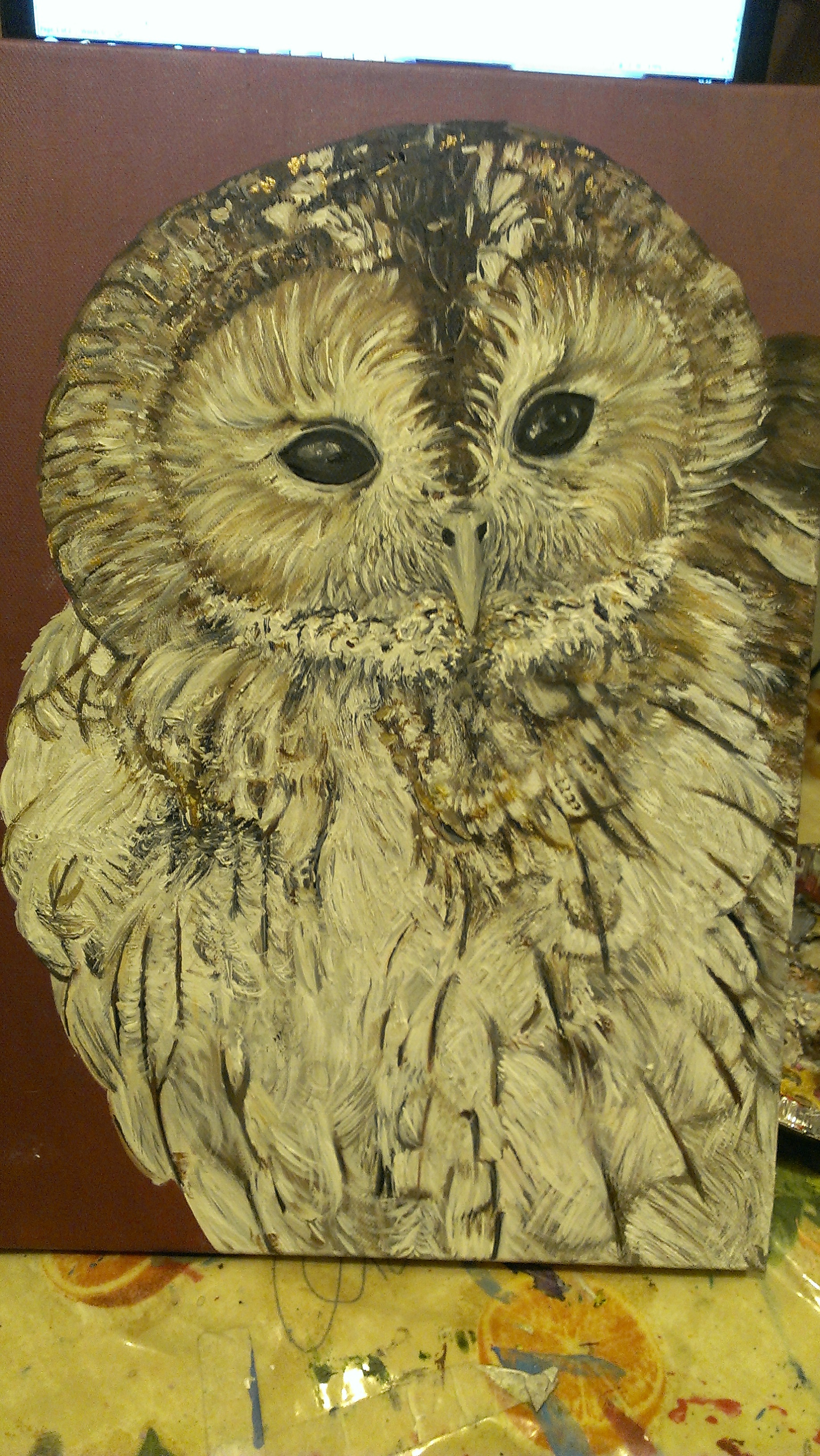
I decided my next painting would be a Tawny Owl. When it was just 1/3 finished, it was reserved by an interested buyer! It was such a challenge but a true pleasure to paint! I named it Nelson, after my Grannie who loved all owls.
IMG_1563
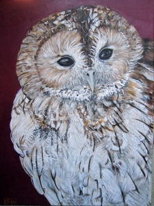
Nelson has been bought and will soon be jetting off to Canada to mark the beginning of IMI paintings overseas! 

Still thrown into fayre preparations, I found time to paint a cute jackass penguin on a 50x50cm canvas. The sea and sand were the biggest challenge for me, as they required a lot of persistence and patience.

Penguin ARTbyIMI

I was so pleased with how it turned out! 

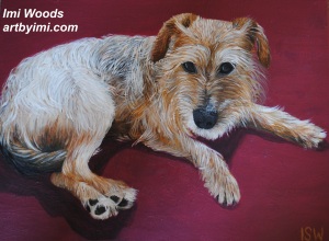
Most recently, I have painted a little King Charles Cavalier Spaniel. I rushed to get it completed before the fayre so that he could come with me and cheer me on.
Bertie ARTbyIMI

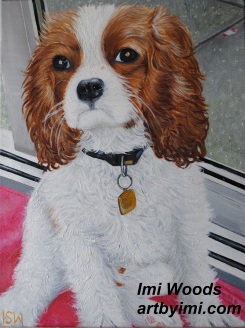
Maybe due to the painting or due to me, the fayre was a success and I got a lot of lovely comments. The owner came to pick up her painting on Tuesday and I received a hand written note of thanks stating how much she loves it. 

I am working on a couple of projects at the moment but they are secret and not ready to share!!

I feel as though I am moving forward… painting and my art business has gone from being my calm-down activity into a full blown lifestyle.

I am so much happier and healthier and back to ME again.

One day I will conquer the art world, but for now, at least I have sort of conquered myself!!


Have you ever noticed a beginning to a new phase of your life? Have you given your site an overhaul as it no longer felt like you?

Like squats… only for your face.

On Monday, I had my first stall EVER at Rowledge Village Fayre.

But what did I learn from this experience?

IMG_1604

1. Don’t underestimate the weather: I obsessively checked the weather for about ten days before the fayre. As I grew closer to the big day, I was checking four or five times a day. Great! No rain due! Glance over the fact that there are gale force winds. 

I arrived at the fayre two and a half hours before kick off to set up my wall-less gazebo. As soon as my stock was put onto the table, it was blown over, even my large glass-fronted framed print kept toppling over. My large orange display board? Forget it, that was threatening to fall over on my head, catapulting my original paintings everywhere.

Thank goodness for mum’s friend offering me a space in the big gazebo. Everyone shoved along and, although it was cosy, it saved the fayre for me.

2. Do some warm up facial exercises beforehand: I am generally a smiley person anyway, but no person’s face is used to smiling constantly for over four hours! Think of it like doing squats in the weeks leading up to a skiing trip… only for your face. Face squats.  My Stall!

3. Paint on the day, but don’t expect a masterpiece: I didn’t take all of my paints and paintbrushes with me. I couldn’t get close to my photograph, and I couldn’t zoom in on a screen like at home to see the detail.

BUT it looks great, and it invites people to watch you without feeling pressured to talk to you. Its a conversation starter! My friends from work said “Now we have seen proof that you actually DO paint!” It makes your artwork authentic and more personal. 

Photo: Talented artist at work

4. I am king of the kids: The tiniest little boy stared in complete rapture as I painted a meercat. I had no idea that little boys’ attention spans could be that trained on something that wasn’t going VRRROOOOM VROOOOM! After a while, he told me “that is a really good painting.” in a sincere and strangely adult way.

Another little girl kept coming back to watch me, saying “I wish I could paint like that”. I told her that at her age, I couldn’t either, and if she started practicing now – she would probably be better than me one day! Inspirational words!

5. I need to man up: Imogen! Be brave! People have spent a while watching you paint and complimenting your talents. Give them a business card, invite them to sign up to your newsletter for the chance to win a painting! Do something or you are the nameless girl at the fayre who can paint, but other than that you are forgotten.

For any blog readers, I am doing my prize draw in June. Anyone who subscribes to my newsletter is in with the chance to win a bespoke painting worth £95! If you have always wanted a painting, what have you got to lose? In my own words, man up!

logonewsletter2

6. Don’t forget about your main market: At the fayre, I branded myself mainly as a painter of birds. I forgot my pet portrait leaflets, and I neglected the market of dog owners who were all conveniently at the fayre entering Fido into the “Waggiest Tail” contest. What a wally.

flyer

7.  People are wonderful: Seriously. I felt overwhelmed with all the lovely comments I received. I am so thankful to everyone who came to support me, including the strangers who have no previous investment in me – who just genuinely like what I have to offer!

One lady flicking through my portfolio said “Your paintings are more lifelike than the photographs!” Wow. Day made! 

What have you learned in retrospect after a big event?

Going off photo when the photo is… off

Caution: the following includes an artist with a serious case of “a bad workman blames his tools” syndrome.

As an artist who strives to get animals as accurate as I possibly can,
going off-photo goes against all my principals. 

Funnily enough, it is only when I perceive the photograph to be “wrong” that painting stops being a lovely relaxing experience that comes naturally to me.

Instead, it can instantly become stressful, and I can be heard muttering “hate this stupid dog / eye / leg / insert anything here”.

It’s at that point that I know that a quick fix is not possible. The photograph looks all wrong, and to avoid my painting looking all wrong, I have to go off book, or find a new bit of photograph to copy.

Exhibit A… the loveliest little King Charles Cavalier Spaniel, Bertie.
bertie

Look at his lovely face, fluffy ears and glinty eyes.
Awww. That makes for a lovely relaxing painting session, with a hint of a challenge.

Now scroll back up and look at those legs.
What the heck is going on there???
They are all over the place!

Paws are conveniently cropped out of the image, so I can’t really even work out what is back leg and front leg, what is body and what is tail.

I am left stumped as to what is going on and to how on earth I will paint this random assortment of white limbs.

So I painted it as per the photograph.

And as expected, it looked all wrong.

My own mother gave herself the role of “Quality Control” and told me I needed to change it.

Grumble Grumble.

I love painting, but I don’t love repainting a painting that I thought was a finished painting.

 Back to the drawing board!!

How to prepare for your first art stall

Hello everybody,

This is a little guide on what I have learned for far in preparing for my first art stall at Rowledge Village Fayre. It hasn’t happened yet, so things could still go very very wrong… But I feel like I have learned a lot, so thought I would share my learnings with you today!

1. Never underestimate how much you have to invest: Bulk buying greeting cards, giclee prints and other items is EXPENSIVE. I was prepared for that. What I wasn’t prepared for was how much everything else costs!

You know those little mounts that you get around fine art prints, and even school photographs? They are as expensive as the print itself. And they just get thrown away. Then you add plastic wallets to put them in. EX PEN SIVE.

To keep my (and the customer’s) costs down, I got plastic wallets and just plain cardboard which I attached photo corners to to keep the print secure… considerably reducing the price of presentation of each print, but not impacting on how professional they still look.

2. People need to be shown exactly how to display your goods: Don’t leave it up to imagination, if your prints look great with a black frame and a smart mount, show people by investing in a nice frame. I am getting an A3 kingfisher framed to show people just how fantastic it looks. As proud painter and owner of the original, I hate to say it, but the framed print looks better!

3. The most simple of stalls still has many complex things holding it together. How do you create height to make an interesting display? How do you make all of your products look professional? How do you catch people’s eye in the first place? How do you hang items? Next time you visit a stall, look at all of these things. They all take lots of planning and lots of cost, especially the first time round.

I am planning on using coloured boxes to display my prints, cards and paintings at different heights on the table. I have borrowed two three-panel boards from my mum to hang my paintings off. I have drawn birds eye views of where the table, easel, boards and stock will go. Next weekend I plan on having a practice set up of everything to see how it all looks together.

4. Your painting time will seriously suffer: I am spending so much of my time thinking, writing blogs and newsletters, planning and buying for the fayre that any time spent actually painting is very limited. Someone once told me that when starting a new art business, about 50% of your time will be taken up with running the business, not actually painting. More like 80%!

5. Test the market by getting greeting cards in many many designs: A good quality place will send proofs through to you to make sure the colours are right before you buy. The proofs of mine are done and look great! I am getting between ten and twenty of each card, because who am I to say what people will like the best? I know which are my favourites, but which are yours?

6. Email addresses of interested customers are like gold dust: Create a newsletter so you can get people to subscribe to it – emails and advertising! In my opinion, my newsletter is full of interest and creativity, and I enjoy reading it… but for those that need extra incentive, I am choosing one lucky subscriber at random to win a painting on June 1st. I will tell every customer about this amazing opportunity so hopefully I will get lots of interest!

logonewsletter2

7. The little details will make you memorable: In each print and each greeting card, I am putting one of my business cards with a handwritten note saying “thank you for your custom!” or similar. I really really appreciate ANYONE who buys from me and supports my business, no matter how small a purchase. Even just a like on facebook. I appreciate it all! So tell them.

8. Be prepared for your boyfriend to appoint himself Managing Director and Marketing Manager of your company: I actually got told to “check with me before you make any business decisions please.” He was being serious. His Dad also seems to have appointed himself ‘Marketing Executive’… I feel there may be competition!

What important lessons have you learned in the lead up to a big event?

Pick up a paintbrush and paint a penguin

Over the last couple of weeks, I have been painting an African Penguin skipping on a beach and eating a tasty fish.

The photograph was lent to me by a man at work. I loved the beautiful lights on the water, the pastel colours of the background contrasted with the black and white of the penguin. It was an exciting project and a brand new challenge to me.

The perks of being an Artist over a photographer though, are you can eliminate the tell-tale signs of captivity – the tag on the wing, the half masticated fish. I could also get rid of imperfections like the irregular beak and the red eye.
photo

The result – quite pleasing if you ask me!

You will need:

  • About 50 hours.
  • 50 x 50cm canvas
  • Photograph to copy
  • Large flat paintbrush
  • Range of smaller round paintbrushes
  • Large playmat
  • Water
  • Pencil
  • Ruler
  • Masking tape
  • Rubber
  • Acrylic paint for sea:
    • White
    • Deep Turquoise
    • Process Cyan
    • Flesh Tint
    • Leaf Green
    • Phthalo Turquoise
    • Cadmium Yellow
  • Sand:
    • Burnt Umber
    • Burnt Sienna
    • Flesh Tint
    • Rich Gold
    • White
    • Mars Black
    • Silver
  • Penguin:
    • Mars Black
    • White
    • Flesh Tint
    • Metallic Blue
    • Silver
    • Burnt Umber
    • Burgandy
  • Fish
    • Silver
    • Leaf Green
    • Burgandy
    • White

A fully stocked artist’s box is not a bad thing – makes all that paint so much more affordable over many years.

  1. Draw up your canvas: see here for a detailed how to guide!
    IMAG0950
  2. Paint in the water: Firstly do a colour wash in a pale blue, then use a large flat brush to paint horizontal strips of colour in varying shades across the area. The photograph was better than life – with gorgeous shades of green, yellow, blue and even peach.  The trick is keeping all the brushstrokes in the same direction and building up layers and layers which takes hours but is worth it!
    water
     
  3. Paint in the sand: Paint a colour wash in flesh tint over the area. They use a variety of rounded brushes to paint speckles of varying browns, silvers, white, sand colours over the entire area. This requires you building up layers, even more so than the sea. You will probably get impatient like I did and have to do this over several sessions. Keep referring back to your photograph to get big stones etc in the right place.Then paint the shadow. The trick here is to create a really watery black paint, with absolutely no white in it to make it creamier. Just neat black with water. Then use a flat brush to wipe this over the area so that all the stones and sand can still be seen through.
    sand
  4. Paint the wings: First do a wash in black. Then use slightly paler purple and bluey shades to create volume and areas of light. On the near wing, use metallic blue and silver paint to give it a wet look, and paint a white strip where the sun bounces off it. Keep all of your brush strokes horizontal to match with the direction of the feathers.
    wings 
  5. Paint the back: If you refer back to the photograph, you will see lots and lots of black feathers standing on end, glistening with oil and sunlight. To capture this, do a black colour wash, then use a little round brush and dab lines of small silver, grey and white dots to act as the tips of every feather. Going further down the back, the feathers lie flatter, so use longer brush strokes, angling them diagonally down the back.
    IMAG0980 
  6. Paint the softer white areas: Use white paint with a teeny bit of black mixed in to create areas of shadow. African Penguins have little grey speckles on their bellies too, so be sure to show this in your painting.
    IMAG0988
  7. Paint the face: Use the same technique as the back to create an area of light and areas of shadow on the face.
    IMAG0990
  8. Paint in the beak: I went off photo for the beak, to find a more visually pleasing one on another African Penguin! Use black, grey and silver, score likes and texture into it, and leave a gap between the top and bottom beak to show the background through. IMAG0995
  9. Paint in the fish! The original photo had a cooked and half cut up piece of fish. I wanted a fresh fish in my picture, so found one on the internet. Use shiny silver and pale greens to capture the beautiful shimmer of the scales.
    IMAG0999IMAG1020
  10. Paint in the feet: Use similar colours to paint the feet, carefully following the photograph to create mottled skin.
    Penguin ARTbyIMI

Ta daaaa

What do you think of my p p p penguin?

And more importantly, what should I name him?


How to paint a Tawny… Owl by yourself!

As promised, I have been a busy bee over the bank holiday weekend as it is now officially April, my Month of Paint! I finished off painting this little cutie today. His name is Nelson, not after Mandela, but my Grannie, who loved all owls.

If you pay particular attention throughout this guide, you can see me sporting a lovely range of pyjamas. I really am spoiling you.

You will need:

  • About 30 hours!
  • 30cm x 40cm canvas
  • Photograph to copy
  • Large flat paintbrush
  • Range of smaller round paintbrushes
  • Large playmat
  • Water
  • Pencil
  • Ruler
  • Masking tape
  • Background Acrylic Paint:
    • Cadmium Red
    • Burgandy
  • Owl Acrylic Paint:
    • White
    • Burnt Sienna
    • Burnt Umber
    • Raw Umber
    • Rich Gold
    • Mars Black
    • Hooker Green (small amount)

Canvas Preparation

1. Choose your composition. I cropped my photograph really close so I could focus on the face and feathers and have as little background as possible.

Nelson the tawny photo
I grid up my photographs using microsoft word

2. Mark up your canvas. For a 30 x 40 canvas it is easiest to do 5cm2 squares. If you grid out your photo on a screen, make sure that your scaled dimensions are the same. You will probably have to crop parts of your photo and expand it to fill the space.

3. Draw the outline shape of your subject onto the canvas, following the corresponding squares on your screen. For a more detailed way of doing this, see here.

IMAG0911
I just draw the main lines and markings

Painting the background

1. Mix Cadmium Red and double quantities of Burgundy together with a bit of water. This creates a beautiful rich damson colour. You can add a hint of white to make it more creamy.

2. Paint about four layers of paint over your background area. This will create a solid matte colour. Hold it up to the light. Can you see through it? If so, paint another layer!

IMAG0918
You can overlap the foreground as you will paint over this later.

Painting the owl

At first glance, I thought… how on earth am I going to get everything in the right place?! There is so much going on!
Then I chilled out a bit and decided to take a little bit at a time. What a life lesson.

1. Use masking tape to section off areas to paint: I started from the bottom taking the right hand corner, and gradually worked my way up the canvas in 5cm strips, completing each strip before moving onto the next.
IMAG0920
My art gear of choice was blue striped pyjamas. 

2.  Start with a wash of Burnt Umber mixed with white. This creates a brilliant basis to build up layers of white feathers over the top.
IMAG0921
The more layers you build up, the fluffier it will look

3. Use a cocktail stick to create finer lines and texture in the feathers. Scratch the black bards into place using a near black. Scratch little flicks of white feathers. Some feathers will look softer and fluffier, so use a little paintbrush to achieve this look.

Who would think my pyjamas would be so famous!

4. Complete the whole strip using the same techniques, making sure the black and brown bards are painted into the right place. Keep referring back to your photograph – it’s only a little section, you can get everything in the right place easily!

IMAG0924
My photography skills are second to none.

5. Section off the strip above using masking tape. Paint on any bards and darker areas of feathers, blending them into the finished part below.

Be careful to blend the two sections together or you will get a visible line.

6. Build up layers using streaks of white and tan colours, using your cocktail stick to make texture and individual feathers. The body of the owl is generally paler and greyer, and becomes more coloured and brown towards the face.

IMAG0928
You can see that by taking it section by section, you can get it really accurate.

7. Introduce browns and golds to the upper chest area, below the face. The feathers here are darker, with more golden pigments than the lower belly (all very technical terms!). Make the paint really nice and thick, building up the layers with differing shades. Use your cocktail stick to introduce little speckles to the feathers.  Please keep referring to your photograph to get markings in exactly the right place. I assure you that patience is the only way to get a photo-realistic finish.

IMAG0929IMAG0930
With a little patience, the feathers are not as daunting as they first seem.

8. Begin on the facial disk. Below the face is a white fluffy curve, framing the cute little face. Use really thick white paint here and score shapes into it using a cocktail stick. Then add black, gold and brown mottles to it on top of the thick wet white paint.
IMAG0934
You can see the glints of gold I am starting to work in. 

9. Paint the area surrounding the beak a pale browny grey. Then score thin white and darker grey hairs into it to make it textured and fluffy.
IMAG0936
Use a cocktail stick to create texture.

10. Surround the eyes with tan, white and pale brown paint, using longer curved brush strokes  Continue to build up layer upon layer, with paler colours on the top layers. Paint the brown strip down the middle of the face, and overlap the face hairs to create a semi-symmetrical pattern.
IMAG0940
Keep painting on layer after layer for thick fluffy fur.

11. Paint the eyes deep black, then rim them with pale grey. Create pale grey glints in the eyes to make them look glassy and real. Put grey lines above and below to define the eye socket.
IMAG0942
He just came to life when I painted in the eyes.

12. Paint the disk surrounding the face, using small dabs of tans, browns and black. Again, continue to build up layers, joining the face and the surrounding disk with a darker join. Put dabs of gold into it to make the painting really eye catching.
IMAG0944
At this point, my dad normally starts going “its very clever”

13. Paint the visible wing with a brown wash, then dab several layers in shades of light brown and tan into it.
IMAG0945
Do you see the resemblance?!

14. Mix up a pale yellowy green for the beak. Put shadows in a more grey green and a highlight in a paler colour down the middle of the beak, then paint on little nostrils using near black paint.
IMAG0947
Are they called nostrils??

15. Neaten up any smudges on the background and then SIGN!
Nelson ARTbyIMI
I am a little bit in love with little Nelson 

Let me know what you think, and stay tuned for lots of updates throughout April, my Month of Paint! 

My Etsy Shop

logoshop

Hello Everyone!

You can now order and buy my art worldwide through my Etsy Shop!

You can find me at http://www.etsy.com/shop/ARTbyIMI.

I will continue to add items over the weekend, so please have a browse!

Love Imi

How to paint a Golden Retriever

This guide tells you how I painted Annie the Golden Retriever for my Godmother. She is a friendly energetic dog and very much loved. I finally got to see her today to hand over my masterpiece.

You will need:

  • Paint – Dog: Flesh tint, Burnt Umber, Raw Umber, White, Mars Black, Burgandy, Violet, Rich Gold
    Grass: Sap Green, Olive Green Burgandy, Violet, Lemon Yellow, Raw Umber etc.
  • A Canvas –  I use 30cmx40cm as standard
  • Playmat – I use a big old plastic table cloth
  • Paintbrushes – a large flat one and a variety of small round ones.
  • A pot of water
  • A palette – I use foil cases from quiches.
  • A photograph to copy – I have mine up on my laptop screen with gridlines drawn on
  • A pencil
  • A ruler.

Canvas Preparation

1. Mark up your canvas. For a 30 x 40 canvas it is easiest to do 5cm2 squares. If you grid out your photo on a screen, make sure that your scaled dimensions are the same. You will probably have to crop parts of your photo and expand it to fill the space. With this painting, I made the call that the edge of the paws could be missed out to make the rest of the dog fit onto the canvas.

IMAG0867_1[1]

2. Draw the outline shape of your subject onto the canvas, following the corresponding squares on your screen. For a more detailed way of doing this, see here.

Painting Grass

If your background is grass, you can follow this guide for long grass, and this guide for short grass.

IMAG0881[1]

Painting a Golden Retriever  

1. Paint areas of shadow on the face with a grey / Flesh Tint, Burgandy mix. The areas around the nose seem to be darker, whereas under the eyes is blonder.

IMAG0882[1]

2. Use paler colours on areas of light (Flesh Tint, White, Raw Umber) and small sweeping brushstrokes with a little rounded brush to create fine hairs all over the face, concentrating on areas of light and shadow. Outline the nose in a near black, and use black to draw the gums. Use small dots of white to create hair follicles around the nose.

IMAG0883[1]

3. Continue adding layers of hair and volume on the face, and rim the eye in black with a gentler grey surround.

IMAG0884[2]

4. Start to paint the ear. Firstly paint a short colour wash in a mix of Raw Umber, Burgandy, Burnt Umber, with the ear becoming darker and more shadowy towards the bottom. Then when that is dry, create little curlier hairs in white, Flesh Tint and Raw Umber.

IMAG0886[1]

5. Start to paint down towards the dog’s chest using your big flat paintbrush. Using Violet mixed with white creates really natural looking areas of shadow for a predominantly white chest.

IMAG0887[1]

6. Lengthen areas of shadow (greys, Violet, Burgandy, Flesh Tint etc) up the dog’s back and towards her paws.

IMAG0889[1]

7. Pay attention to the direction of the hairs and blanched out areas. Little curly patterns of hairs formed on the back of this photograph, so I used longer brushstrokes in a roundabout motion to capture this.

IMAG0891[1]

8. Keep adding layer after layer to make the painting look really 3D and fluffy. Work over the shadow with lighter tones, using little sweeping brushstrokes.

IMAG0893[1]

9. Continue the shadow down the legs using a grey based paint. Create lots of individual hairs with a watery white / Flesh Tint, going lighter and lighter towards the paws.

IMAG0895[1]

10. Lengthen strands of grass to come over the dog’s body to join background and foreground together.

IMAG0899[1]

11. The dog’s eye was a REAL challenge for me. I know it looks fairly done in the photos above but it just wasn’t quite right. I ended up painting over it entirely to try again. It put about five hours onto the end of my painting. I had to study other photographs of Annie to appreciate her nutty brown eye colour – which didn’t come across in the photo I was copying. Anyway, I am finally pleased with it.

eyes

FINITO. I estimate this took me about 30-35 hours although I never keep proper tabs on these things.

Annie 2 ARTbyIMI

Please let me know what you think!

How to paint a golden pheasant

I painted a golden pheasant to enter into the Wildlife Artist of the Year competition 2013. It is on a 70cm x 70cm canvas, and it used a lot of paint! But I am pleased with it, so thought I would share with you today how it was born.

 You will need:

  • A 70cm x 70cm canvas
  • Your photograph with gridlines drawn on, (this can be on your laptop screen)
  • Lots and lots of colours of acrylic paint (including GOLD, purple and yellow 🙂
  • A palette (I use empty foil dishes from quiches. My parents are quiche fans!)
  • Water
  • Masking tape
  • A variety of sizes of paintbrushes (large flat ones, a set of varying sizes of little rounded ones)
  • A playmat!
  1. Firstly I drew up my canvas, gridding on the main outlines of the bird and the many different sections of feathers to the corresponding square on my photograph.

    IMAG0777[2]

  2. Next I did a thin colour wash on each section. A bit like painting by numbers!
    IMAG0793[1]
  3. With the section of thin yellow feathers on his back, I firstly painted the section a darkish yellowy browny colour. I then used a little round brush and pale yellows and oranges to swipe little feathers onto the canvas. This part took ages as I really wanted it to match the photograph totally.
    IMAG0795[1]


  4. With the orange feathers with purple tips, I firstly painted it orange. I then sectioned off parts using masking tape as it all looked the same! This enabled me to paint the purple patterns onto the canvas in exactly the right place.

    IMAG0799[1]

  5. After I had finished this, I proceeded to go over and over this section with swipes of white, yellow, orange and gold to make the feathers look 3D. I used blue, purple and metalic blue on the tips, again using a little rounded brush.

    IMAG0811[1]

  6. With the blue feathers at the bottom, I used varying shades of blues and purple and white to create large feather shapes.
  7. With the pink feathers, I used the little rounded brush again, with a mix of purple, magenta and white feathers, constantly referring to the photograph to get areas of light and dark in the correct place

    IMAG0812[1]

  8. With the narrow blue feathers above the yellow section and below the orange section (I am losing track too!) I firstly painted it dark blue. Then I used metallic blue mixed with normal blue and a touch of white to create a 3D effect when I painted each feather shape.
  9. Next I concentrated on the face , using my littlest brush, and a range of browns and purples and my favourite colour, flesh tint! I used little curly brush strokes to make the face fluffy.
    IMAG0813[1]
  10. I painted the eye using white with a hint of green, to create a pale aqua. I made sure to put a little white gleam on the pupil.
  11. I used a fairly large round brush and thick yellow paint to create the mohawk, using long sweeping brushstrokes in varying shades of yellow. I then used white paint to create strands of hair caught by the light.
    IMAG0818[1]
  12. Finally, with the beak, I used browns and gold paint to create a shiny pointy beak.
  13. Its not my normal style, but I painted the background last! Im normally a firm believer in painting backgrounds first. However, I really couldnt decide what to do with it. I plumped with a base of sap green, using my hands to rub in lighter areas with white and yellow and darker areas with purple to create a soft focus.
    goldenpheasantjan13wm

Ta daaa – Hope you liked the guide and let me know what you think!
I will keep you posted on how I do in the competition!